FMP: Sigma discussion *SPOILERS*
Moderators: KiLlEr, HELLFIRE, Taurec
- RADRAD
- Broken Beer Bottle

- Posts: 73
- Joined: Sat Apr 23, 2005 8:57 pm
- Location: If I told you, I'd have to kill you.
- Contact:
FMP: Sigma discussion *SPOILERS*
B-T put out the first chapter of this manga, and I think a discussion topic is necessary.
Well, it appears this manga is following ODBD with a few minor adjustments, although I don't recognize the female character on pg 17. I'm sure someone here knows her.
Well, it appears this manga is following ODBD with a few minor adjustments, although I don't recognize the female character on pg 17. I'm sure someone here knows her.
"Just say it. Who am I? What's my post & rank?" Teletha "Tessa" Testarossa, Full Metal Panic: Continuing On My Own
Re: FMP: Sigma discussion *SPOILERS*
She speaks Cantonese, so she's probably one of Gauron's twin female assassins. Looks like we're following the anime for now, even if I think the pale hair is a little off.RADRAD wrote:Well, it appears this manga is following ODBD with a few minor adjustments, although I don't recognize the female character on pg 17. I'm sure someone here knows her.
One major difference between novel and manga: in the novel, the kidnapping attempt is on a "Vincent Bluno", an American male over 40 with blue eyes and brown hair. Here, his character has been transformed into a younger lesbian. (...
I like the art, although Sousuke seems to look a little more boyish and less rugged than in his previous incarnations. Don't know why.
Notes to Boku-tachi:
1.) You could add a note on why the lesbian (I feel odd calling her "Bluno") refers to the capo as "Papa" in pic no. 18, like in the novel - I almost thought the girl was actually the daughter whose birthday was being celebrated.
2.) On that note, shouldn't "capo" be "capo", and not "cappo" as it's spelt in pic 21? It's the Barbara family, and "capo" is a title given to the head of a crime syndicate, after all.
3.) Pic 34: The line "What military would you have us shoot it out with?" sounds strange - I thought they were talking about the weapons. Unless you're suggesting, "Which military _organisation_ would you like to blast?", which is strange.
-
Taurec
- Drill Sergeant.

- Posts: 9247
- Joined: Tue Oct 08, 2002 7:27 pm
- Location: Diagonal parked in a parallel universe...
- Contact:
tnx for the pointer updated the FAQ..
-
"Can I help you?, "you know this section is.." she broke off her sentence as the man walked towards her and nodded, "I think you can Captain".
Tessa looked down, "I haven't been called Captain in 4 years," Wha..what do you want?"
He gave her a devious grin, "I'm here to make sure you keep your promise."
-
๏̯͡๏﴿ <- they know....
█████████
█▄█████▄█
█▼▼▼▼▼
█ Raaaaaaaaawr!!!
█▲▲▲▲▲
█████████
__██____██___
heh, I just went and used mirc for the first time in ages.
I'm not quite sure what I think about it; there are more than a few things that I like, and less than a dozen things I dislike...but for now, I'm crittical, and I'll probably remain that way for some time...the drawing technique itself, I dig, but the story structure..it just feels as if too much was crammed together towards the end...but eh.
It's a very messy comic, though, in some ways...they use gradient shades of grey and all sorts of oddities all over the place, and it would be very difficult to clean properly...
Is it just me, or are there way too many talking decapitated heads around these days?
It is very difficult to clean. =P The original pages are covered in white fuzz, and the oddities you speak of may just be the inch-thick stripes of lighter print going down the middle of the pages. I guess thats the kind of print quality you get when you buy an 800 page magazine for six bucks, heh.
Also, Pyrite, thanks for your observations. I'll bring them to Brandi's attention if she doesn't see them on her own. She's very busy lately. Luckily I already have the translation for the rest of chapter one. =)
-Muka
Also, Pyrite, thanks for your observations. I'll bring them to Brandi's attention if she doesn't see them on her own. She's very busy lately. Luckily I already have the translation for the rest of chapter one. =)
-Muka
Oh, heheheh, I really meant no offense by that "properly" bit at the end, I love that you guys are doing it ^_^
I'd like to clarify that all I was saying was that there's a lot of little annoying artifacts in some of them grey areas that would take a lot of work to remove...
IRT Pyrite:
Well, I'd say Maos dress had a lot more fanservice going for it in the novel than it does now...it was supposed to go so high up that even a panty/thong would show at the top of her legs, even though it was floorlength...
And Sousukes much more boyish partly due to his more real body (in the last manga, you never really got to see much of his skin), partly due to the new structure his face has been given...his hair is bigger (about time), and his chin sits higher up compared to his eyes, eyes which are bigger now, giving the impression that his face is broader...rather than seeming somewhat flat and rugged, that was due to the vast amounts of empty space residing in sousukes face in the last manga...his profile is also different, as a result of this.
This guy does his drawing a very different way, taking form factors and shade of the entire page into account as he's drawing...it's very cool.
Is it just me, or are there way too many talking decapitated heads around these days?
You're probably right about the "larger eyes" part - perhaps that was why I thought the original change was a slimmer face.  Having said that, though, Kaname looks a bit slimmer in the face than in other art. Could be the eyes again, though...
And WRT fanservice: Well, text takes away a fair bit of the impact, you realise. But with the assassins in goth dresses, the peculiar casting change (to borrow a term from elsewhere, "lezbeanz LOL"), one kinda assumes, by this point, that Mao's skirt slit still goes all the way up. Wish they'd kept in Sousuke's line about it changing into a swimsuit, though.
Muka: No sweat. Take your time.
And WRT fanservice: Well, text takes away a fair bit of the impact, you realise.
Muka: No sweat. Take your time.
well, true, fanservice in text is different, but still, the point "if she let him descend first, he'd be able to see her butt" painted a pretty picture in my mind...but on the other hand, mao never was involved in any lesbian makeout scenes, so...yeah, I see your point.. And yes, the swimsuit line was absolutely beautiful.
And well...is her face thinner?...hmm...maybe it's the different eyes...but I see what you're saying...
And well...is her face thinner?...hmm...maybe it's the different eyes...but I see what you're saying...
Is it just me, or are there way too many talking decapitated heads around these days?
(Disclaimer: there are a few images in this post. There are more than five but I have tried to keep them as close to "avatar size" as possible without trashing them with smallness. All but one are just tiny black and white .jpgs so they should load quick.)
Alright, I am really looking forward to seeing DBD illustrated, but I can tell I am going to be driven crazy by the way Sousuke is drawn. When I saw this:

I thought: "Hmmm, I wonder who that little kid is-OH MY GOD THAT'S SOUSUKE! WTF! NOO!"
And then again:

"Wow, what a cute little bo-OMG NOT AGAIN! SOUSUKE! WHAT ARE YOU, FRIGGIN 12 YEARS OLD?"
*dead*
What everyone has been saying is true. This mangaka has really shortened up Sousuke's face, which does, in turn, take away that rugged (sexy...heheheh) older look. Now he looks like a 12 year old running around with a gun:
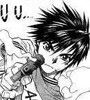
For comparison sake, here are two Tateo Sousukes:

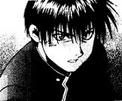
...which I like way better because here he actually looks 17.
I don't know, I just can't see Sousuke running around being badass, kicking butt with heavy firepower and saving Kaname with that cute little boy face. Picture that face on something like this:
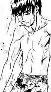
Feel dirty? I sure do.
Oh and Mao. Her face has been considerably shrunken too.
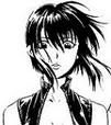 VS.
VS. 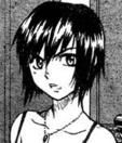
Maybe in the end, the "new Sousuke" is an attempt to look a little bit more like Douji Shiki's Sousuke:

But even that one doesn't look like a little boy.
Ohhhhhhhh wellllllllll
For this thread the policy can/may be seen more as a suggestion, but don't slap complete Manga pages in this thread. -T
-T
Alright, I am really looking forward to seeing DBD illustrated, but I can tell I am going to be driven crazy by the way Sousuke is drawn. When I saw this:

I thought: "Hmmm, I wonder who that little kid is-OH MY GOD THAT'S SOUSUKE! WTF! NOO!"
And then again:

"Wow, what a cute little bo-OMG NOT AGAIN! SOUSUKE! WHAT ARE YOU, FRIGGIN 12 YEARS OLD?"
*dead*
What everyone has been saying is true. This mangaka has really shortened up Sousuke's face, which does, in turn, take away that rugged (sexy...heheheh) older look. Now he looks like a 12 year old running around with a gun:

For comparison sake, here are two Tateo Sousukes:


...which I like way better because here he actually looks 17.
I don't know, I just can't see Sousuke running around being badass, kicking butt with heavy firepower and saving Kaname with that cute little boy face. Picture that face on something like this:

Feel dirty? I sure do.
Oh and Mao. Her face has been considerably shrunken too.
 VS.
VS. 
Maybe in the end, the "new Sousuke" is an attempt to look a little bit more like Douji Shiki's Sousuke:

But even that one doesn't look like a little boy.
Ohhhhhhhh wellllllllll
For this thread the policy can/may be seen more as a suggestion, but don't slap complete Manga pages in this thread.

Kaname=Pwnage
- pseudo-chan
- Broken Beer Bottle

- Posts: 50
- Joined: Sat Jan 08, 2005 8:27 pm
Whew! *fans herself after reading that chapter* I didn't mind the fanservice actually...it definitely made it a bit more "interesting" and definitely served as a "whoa, slow down and READ!" for me (I usually skim through all my manga upon first reading in my eagerness to see all images, then go back and review). I'm sure that was probably the best standy moment Kurz has ever had. ;-)
I thought the chapter was kinda rushed, like the author tried to squeeze in a whole buncha things in at once. For us, it might seem like a nice recap of events from the novel, or at least we all know what's going on...but I can't help but think that someone who hasn't picked up the novels will read this and think "wtf?". For example the part where Mao tells Kurz to "grab the luggage and split"...all of a sudden people are shooting at them, without any alarms being turned on? O_o We can assume that they were caught while trying to escape (as in the novel), but it does give off an obvious impression that things were rushed.
The goth loli assassin just seems so out of place... @_@
I'm still up in the air about the art style, but I think I need to see more chapters to make a decision...I do agree that Sousuke looks much younger, with his big eyes and button nose. I like his new hair though, gives him a more wild, messy look. The colored drawing of him at the beginning of the chapter looks good too.
Regardless, I still think this image of him is teh smex :
:

I thought the chapter was kinda rushed, like the author tried to squeeze in a whole buncha things in at once. For us, it might seem like a nice recap of events from the novel, or at least we all know what's going on...but I can't help but think that someone who hasn't picked up the novels will read this and think "wtf?". For example the part where Mao tells Kurz to "grab the luggage and split"...all of a sudden people are shooting at them, without any alarms being turned on? O_o We can assume that they were caught while trying to escape (as in the novel), but it does give off an obvious impression that things were rushed.
The goth loli assassin just seems so out of place... @_@
I'm still up in the air about the art style, but I think I need to see more chapters to make a decision...I do agree that Sousuke looks much younger, with his big eyes and button nose. I like his new hair though, gives him a more wild, messy look. The colored drawing of him at the beginning of the chapter looks good too.
Regardless, I still think this image of him is teh smex

eh, he doesn't look that much younger...it's true though, he doesn't look like a hulking brute this time (as opposed to the last manga), but then, in both the anime and in shiki's illustrations, his impression is definately not that of a brute, but rather of a very agile dude...with Fumoffu it's a little less so. Either way, you don't need to be brutish if you're seventeen...you can possibly be...but all the same, when you're 17, you're still just a kid...
I think it's a lot better this way, since it conveys the playful bitchslapping he is put through better imo. Kaname seemed like a sadist in the last one (imo again), this time, she's just hot tempered.
The style is definately growing on me. Limps, muscles, and clothes are done in a very organic way, which is really a plus for me.
Oh yeah, and don't go jumping to conclusions about that goth girl being an assasin yet, it could just be wraith playing dress-up...
Is it just me, or are there way too many talking decapitated heads around these days?
Well, if you were a child soldier from Helmajistan/Afghanistan/..., you'd be expected to look a little older. I kinda miss the tanned, rugged look myself.
 (Yeah, and that lesbian chick might well be Leonard in drag, for all we know...
 )
)
And the expression on the mobsters' faces when the Ferrari blows up is priceless. They were like ... and the next thing they know,
  .
.
I get the feeling you're joking.AEmer wrote:Oh yeah, and don't go jumping to conclusions about that goth girl being an assasin yet, it could just be wraith playing dress-up...
And the expression on the mobsters' faces when the Ferrari blows up is priceless. They were like
it's pretty evident the goth loli girl is one half of chinese twin assassins. She refers to Kaname by the Chinese version of her name and mentioned 'sin sang' .... plus she said "Kashim". And we all know who calls Sousuke by that name....Oh yeah, and don't go jumping to conclusions about that goth girl being an assasin yet, it could just be wraith playing dress-up...
btw, i'm diggin the new artstyle. Kurz is such a hottie in my eyes now LOL
heheh, I wasn't entirely joking, actually...Wraith dresses up in some crazy outfits from time to time...
And yes, it's true, she speaks chinese, and she calls him Kashim...that is only circumstancial evidence however...we haven't seen wraith yet, that's the only point I'm making...
And yes, it's true, she speaks chinese, and she calls him Kashim...that is only circumstancial evidence however...we haven't seen wraith yet, that's the only point I'm making...
Is it just me, or are there way too many talking decapitated heads around these days?


